Promotional Holiday Gift

We needed to send movie gift cards to clients.  Hiding them in containers with popcorn seemed much more creative than sending them in envelopes with a holiday card.

Shower Steamer Packets

Using the exiting pattern on the outer package, I had to design the packets for each individual tablet.  There were 6 different fragrances, each with their own color and pattern.  I pulled the images off the existing pattern (above the packet images) to make a packet that was specific to the scent but consistent with the outer packaging.

Formulary55 Bath Salts

Formulary55 started a new line of bath salts.  I was given the pattern for each scent.  I had to combine images from different scents to represent the combination in each bath salt version.  Keeping design consistent with existing packages, I created a new front and fit all of the regulatory information in an aesthetic fashion.

Formulary 55 Body Oil

This was a new product with 4 different fragrance combinations, each with their own specific images.  Matching the existing package style, I designed labels and packages.

Formulary 55 Hand & Body Cream

This new product needed packaging and labels.  I had to keep brand consistency across all products.

Mood Room Sprays

Working with a team, the design from another product had to be altered to work with these bottles. The challenge was making the text and logo legible on a gradient. White stands out on the bottom where the gradient is darker but not on the top section where it is lighter. I came up with a solution to help the logo and name pop on the lighter areas. The other challenge was fitting all of the legal text on the back. The client wanted to keep the seam at the back. I had to get all of the languages to fit along with all of the legal requirements and split them on either half of the back, while keeping a coherent flow.


Citronella Fragrance Oil Labels

There was an existing pattern for this line.  The labels were small and very text heavy.  I did prepress edits to the pattern and colors so that they would print correctly and laid out all of the elements.  The label had to wrap around.  The challenge was making the front look separate from the back that had heavy regulatory text. 

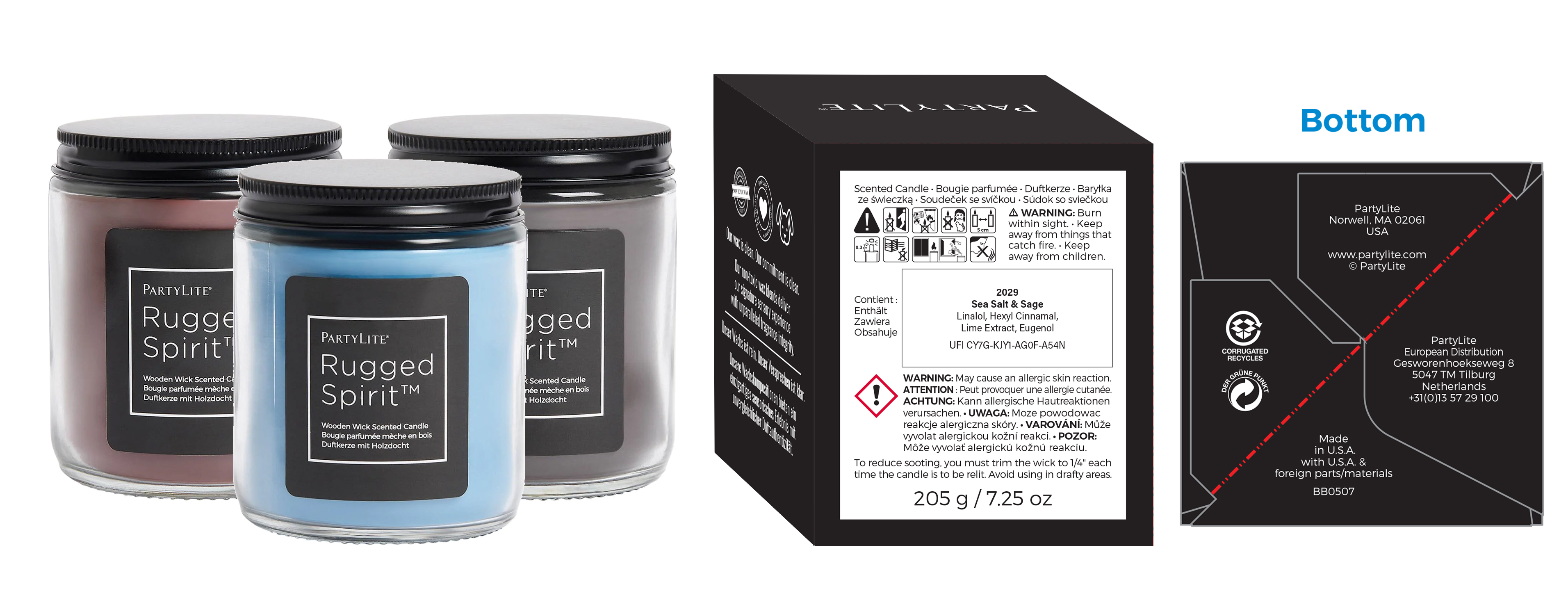
Rugged Spirit jar candles 

This was directed to male customers.  The design had to be simple but masculine.  I designed the label and the front of the package in addition to all the production work on the back and bottom of the package.
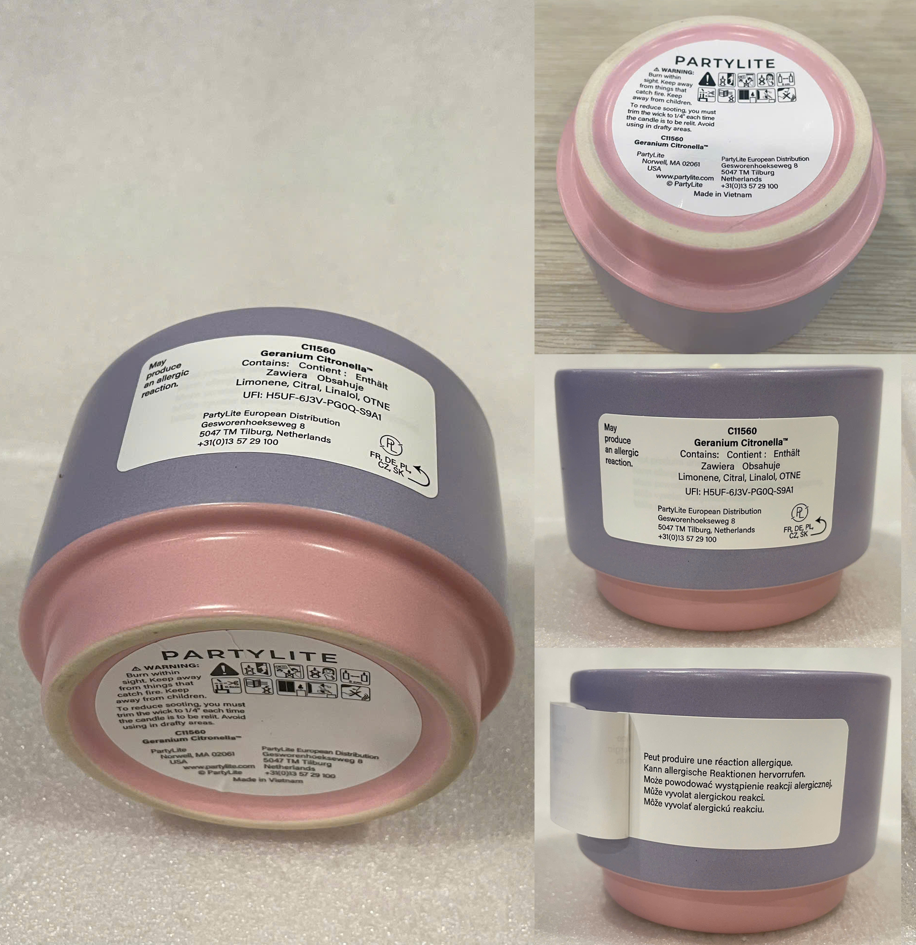
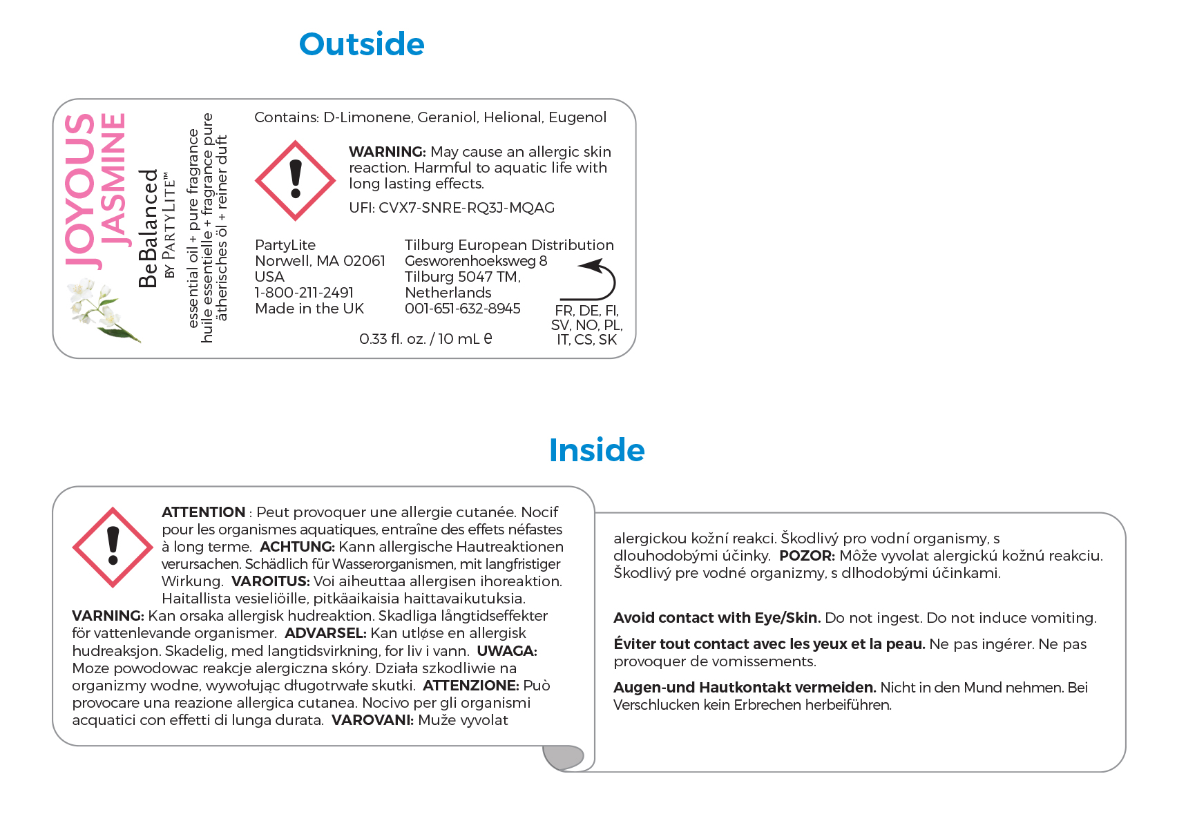
Labels: bottom and warning labels 

This candle needed a bottom label with the generic warnings required by regulatory.  This was sold in Europe and required additional warnings in 6 languages on a peel up side label.  Most products I worked on required one or both of these types of labels.

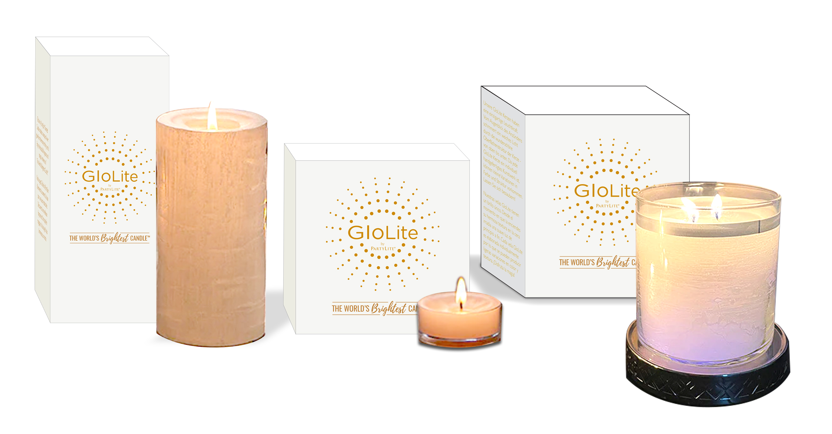
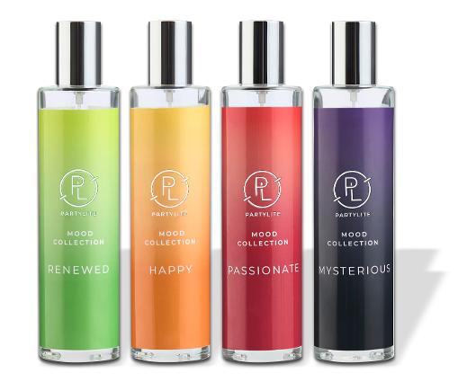
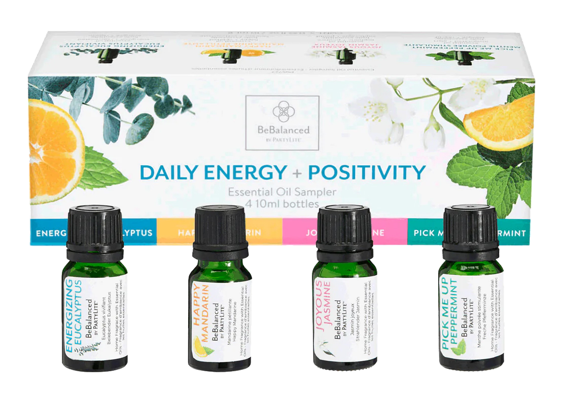
Glo Lite Line: tea lights, pillars and jar candles 

This product line needed a logo that could work across various package footprint sizes and shapes.  Working with the director, I designed a logo and laid out everything on the package, including romance copy and legal text.

Maui Gold

I was asked to submit new designs for a mix of different seasons along with a new premium package.  I manipulated the elements that were on the existing packages and added a few images to accomplish this new look.


Handthropology

The company was launching a new brand focused on hand treatments.  The idea was that we often spend time and money on products to keep our faces youthful.  We often ignore our hands that can also show signs of aging. We needed a logo and packaging that had a natural feel. The packages were given a mock kraft background to look more natural while at the same time, the true white paper stock allowed the vibrancy of the images and colors to come through more than they would on kraft material.  The brand manager also wanted to highlight that the ingredients were native to different parts of the world by adding an international graphics.  


Body by Bette

The brand manager needed a package for wax strips that looked feminine and fun.  An important aspect of this product is that the process was much less painless than competing brands.  This was for an older market so I thought Pin-up girls would be fun.  They felt  carefree with a touch of elegance. 


Cottontail Collection: Hippity and Hoppity

We needed packaging for tea light candle holders to match the existing jar candles.  I took the flower design and created a pattern for the packages that was consistent with the existing design but different to distinguish a different product.

Nailene Treatment Packages

The nail treatment packaging needed a design to differentiate these products from the brand's other product.  At the same time, the design needed to be flexible enough to fit in packages that were boxes with windows, without windows, clamshells and other size/shape variations.

The big circles popped next to the other products on the shelf. The felt soft and feminine which was our target market. I came up with some variations of designs to fit on different packaging.

Canon Paper Packages

Canon wanted to update the paper packaging. We wanted to work on a design that distinguished the different paper qualities, that also kept the design consistent.

The solution I came up with was a design that used a metallic ink bar that represented the level of the paper quality. Gold was the highest quality and the most expensive, silver was high but slightly less expensive, bronze was medium quality and blue represented everyday use paper. In addition to the metallic bar, the packaging had images. The images chosen were examples of the kind of printing the various paper qualities were recommended to be used for. The design chosen for each level of paper quality was used on all the different paper sizes. To fill in the blank space, I used a monotone image in the background. I found images that complimented the main photo that was used. This background image was printed in the same metallic ink as the metallic bar.

The image of the family and the shells on the front were stock photos. The image of the photo albums on the front and the back were shot by me. I cleaned up the images and photoshoped in the stock photos from the front of the package.

Make a free website with Yola